
»Everything that makes up the outward, visible part of a revolution vanishes quickly. A person, an individual being, has a thousand ways of conveying his feelings and thoughts. He is riches without end, he is a world in which we can always discover something new. A crowd, on the other hand, reduces the individuality of the person; a man in a crowd limits himself to a few forms of elementary behavior. The forms through which a crowd can express its yearnings are extraordinarily meager and continually repeat themselves: the demonstration, the strike, the rally, the barricades. That is why you can write a novel about a man, but about a crowd – never. If the crowd disperses, goes home, does not reassemble, we say that the revolution is over.«
In Ryszard Kapuscinski’s world of change, a crowd represents a reduced piece of imagination. The forms through which a crowd can express its yearnings are meager and repeat themselves: stickers, T-shirts, bandannas, performance, petitions, flash mobs, Facebook >causes< and Twitter mobilizations… And if the crowd disperses and does not reassemble, we say that the revolution is over.
An author such as Kapuscinski creates a moment of art when, after he declares, »the revolution is over« he punctuates with a full stop. After that, life continues, a crowd repeats the same forms, and art thunders on.
And then there is a crowd, the mass. There is a crowd that goes home, there is a crowd that stays at home, and there is a crowd to which nothing happens wherever they are.
Where can artists be placed in this picture? There are artists that inspire a crowd to go out of their homes again and again to express »meager« forms of behavior by designing posters and leaflets for demonstrations, strikes and rallies. There are artists that inspire activists by vibrating their code of consciousness with the subtle nuance of art. Do these professionals set out to refine the »meager forms of behaviors« by means of art? Or, do they take charge of the moment of art when an overturning event is over? How does art become a decisive tow to get the crowd out of moral’s surrogacy? Does the political reality give evidence of any of these?
When Kapuscinski wrote this essay on the Iranian revolution in 1979–80, navigating readers to look at his native Eastern Europe, there was no sign of the wave of revolutions behind the iron curtain nor of the Internet, Blackberry, and ether–based social networking. He did, however, witness a glimpse of change, which was anticipating far greater change in his own country later and its significance for the world, when he reported on the dock workers’ uprising in Gdansk in 1980.
In the same year, further East in the South Korean city of Gwangju there was another uprising by citizens against military dictatorship. Both events forever changed the political landscape of the two countries as their impacts echoed far beyond the said countries’ borders. This year various celebrations are taking place to commemorate the 30th anniversary of both events. From Ko Un’s poem to Robert Wilson’s performance , art and culture are contributing to evoke memory of the events. This is another, more personal trip to look for answers, to grasp what has happened after the historical event of 1980 and what direction we are heading in now.
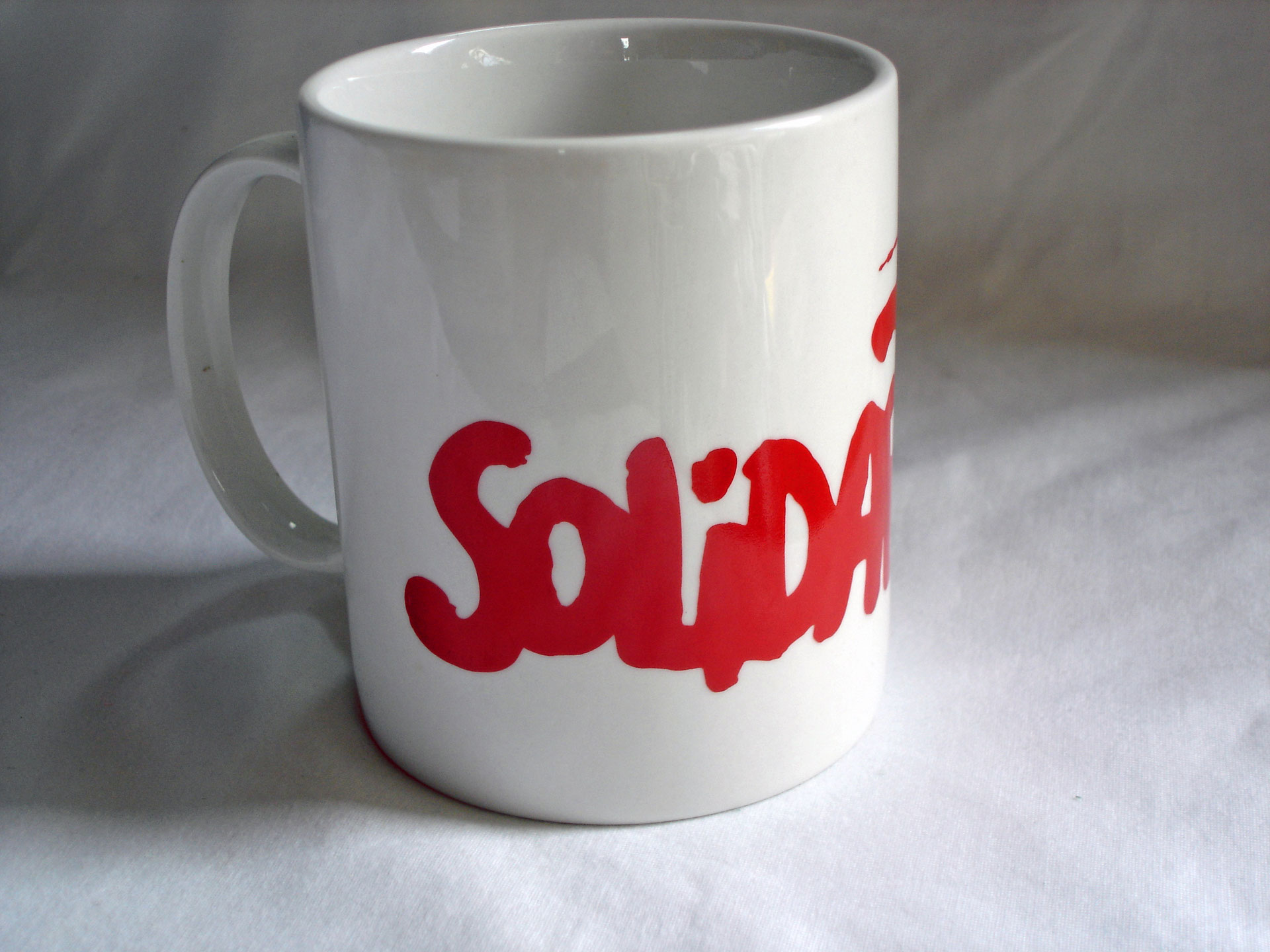
The quest led me to Gdansk, the very shipyard that lit up the year 1980. Except for commemorative objects in various forms and shapes, the shipyard looked as if little had changed since then. The gate of the shipyard hosts wreaths and flowers even now and besides the yard is the monument that forbids us to be oblivious. Then there is this small kiosk by the gate that sells Solidarity memorabilia. We see pens, mugs, posters, T-shirts, badges, pennants – all the classic souvenir items line up proudly, all holding the red logo of >Solidarnosc;< .
I chatted with an old man working at the kiosk and he asked, »You are from – Japan? Japanese tourists come from time to time. But Koreans, many come. They take photographs of the gate, they buy souvenirs.«
I then realized that the small red logo has been connecting the two historical events all these years. Korean union activists travel all the way to this historical site and buy goods with the logo. Back home, they drink coffee from a mug bearing the logo, and write a daily memo with a pen that also has the logo. There are numerous symposia that compare the two movements, but this is mostly how workers keep the memory of 1980 alive in their everyday life.
The wealth of society’s scrabble of the past 30 years is in the tiny logo, which suddenly appeared to me as a compelling mediator between art and social transformation, subsequently raising the question – are there other such designs that may offer us a similar experience? This article is an attempt to examine a jigsaw of footprints where designers have stood, ones I have found in the vicinage of the 1980 spots, anticipating them to compose a larger picture to propose a world–view.
A road to capitalism
The designer of the Solidarity logo is Jerzy Janiszewski, a graphic designer who, in 1980, witnessed the birth of the Solidarity Movement in the shipyard when he was still an art student. Moved by the sea of crowd made up of hopeful, genuine souls and inspired by their graffiti that filled any flat surface in Gdansk, Janiszewski decided to contribute to the movement by designing a logo. The activists shaped letters of >Solidarnosc<, and the iconic logo of 20th century’s social history was born. The logo captured the imagination of union and civil activists so greatly that it was used and copied by myriad civil organizations around the world. The logo has since led movements, the masses, and the media. It probably influenced the course of events, it probably changed history – it was political design.
Based on their poster culture tradition and helped by the rare periods of lesser censorship, the Solidarity movement has created numerous graphics that grace the history of graphic design.
Among the most known is Tomasz Sarnecki’s poster for the first general election in 1989 using the image of Gary Cooper in »High Noon” , and Czeslaw Bielecki’s Solidarity poster with a graph marking ’44, ’56, ’68, ’70 and ’76, the year of failed national rebellions that preceded the Solidarity movement. Both designs are based on the logo, just as all the Solidarity related posters are.
The feat of these designers prompts us to look for clues on how to create successful political design. How could it lead, inspire, manifest, generate dynamics, and interact with situational developments? Lawrence Weschler, in his essay on Polish Solidarity design hints at the reasons of the success of Solidarity design, and the success of political design in general, as follows:
»I’d like to think that the authority of political art, finally, exists at best in proportion to the authority of the politics it advances. In order to work, political images have to command authority, but they can only realize the authority and authenticity of the political context out of which they arise. They cannot endow empty politics with vitality; and empty politics will drain them of their own vitality. Strong politics allow for strong images, and vice versa.«
Weschler also suggests that the strength of the Solidarity graphics lies in their ability to evoke association with the Polish peoples’ communal memory. Polish history has created »we hold ourselves together as we hold our memory together« sentiment in its citizens. Political designers in Poland work on the rich soil of the memory map. This works strongly in Solidarity design, and it can be the mantra for political design elsewhere that share relevance. We might still wonder, after we nod to the powerful examples from Poland, now that the cold war is over, the country is a steady member of EU and NATO, does the logo make the present and the future in apposition to the past?
As the history of the logo unfolded, it has come to symbolize the present and future state of political design and Polish society in general. As a result of a family feud, the very first exemplar of the logo was sold by a family member to an industrialist. Because of the controversy the organizer of »The Dockwatchers« , an exhibition on the Solidarity movement held in the Gdansk shipyard compound in 1995, decided to place the logo in a locked glass box to demonstrate its inaccessibility, which they think betrays the very meaning of the word. The common memory and heritage of the Polish people now enclosed in the capitalist system – this painted a treacherous picture in many people’s minds, particularly in the minds of artists and activists; they were instinctively deeply troubled by the situation that they saw as a premonition of a disturbing future.
A road to the empire of signs
The Gwangju uprising in May 1980 sparked a new era of struggling for democracy in South Korea, the same way as Solidarity did in Poland. In South Korea, 1980 also changed the history of art when the uprising grew into the massive Minjung Art movement. Tamed during the 19 years of Park Chung–hee’s authoritarian regime, artist-activities in South Korea had been limited to activities within highly institutionalized schemes and compounds. Minjung Art changed this. Its spirit encouraged artists to go out of the authorized area and interact with real situations and people. In as much as the Russian avant-garde artists radiated the revolutionary vigor, Minjung artists shared with activists and other folks, a vision of a better society. The word »Minjung« for »people« was chosen over the word »inmin« that also refers to people, because the latter had been used by the North Korean regime to refer to their people. »Min« is people and »jung” is crowd, also with a nuance to grassroots, hence Minjung Art can be described as art of a political crowd. As art critic Choi Min explains, >Minjung Art’
After a decade of struggle, Minjung artists and activists succeeded and witnessed the establishment of a democratic civilian government. The next decade brought further mesmerizing change, from the dictatorial military regime, Confucianism–based patriarchy that feared any liberalization, to an information-based, global, post–modern society that doubted neo–liberalization. Alarm from the neighbor in the North was always present, but in the 1990’s the orchestrated qualm was turned into more positive sound of »Sunshine« diplomacy. Korean brand, K–brand, became a symbol of the »hip« throughout Asia and surpassed J–brand (Japan brand) producing hundreds of stars, clones and groupies that wanted to copy everything K, making us forget the social realism–kitsch factor overnight. As people felt they were suddenly transported into the empire of signs, they themselves became the recognizable sign of K–brand. All these changes were so sudden and extreme that many Korean people wondered if they could ever catch up. In this state of precipitation, the word >Minjung< faded into anachronism, and the phase of Minjung Art in its original form and reason seemed to be over.
AGI (Active Graphic Imagination) Society, a group of designers, photographers, writers and illustrators known for public design and design for activists, unions and civil organizations, emerged out of Minjung Art and continues to elaborate via the form of graphic design. After a period of flourishing democracy and optimism, the economy suddenly collapsed in 1997. AGI Society seemingly emerged in response to society’s call for new artistic intervention. One of the founders, Kim Young Chul, says he even walks into the trade union office as he thinks he can help them with graphic design. In a similar manner the group has designed for the »Against National Security Law« campaign, a campaign against abolition of screen quota, and countless other political campaigns. During the 2000 general election, it carried out on-site design activism that introduced a red card to »The Citizen’s Alliance« for their civil-disobedience action.
By working closely with the local community they created design that reflected local sensitivity, and their work became an antithesis of the globalized logo trend that was rampant in the whirlpool of information capitalism. The 2008 Presidential election triggered yet another new ground of battle for democracy . At present, AGI Society is busier than ever.
revolution vs. stagnation
After a decade of domination by Solidarity designers in political design, Eastern Europe saw a fresh wave of design in 1989 as the region started to shake its walls and the very ground it stood on. The first experience was on June 16 at Hero’s Square in Budapest, at Imre Nagy’s funeral. The funeral site with black and white decoration on the façade of the Palace of Art designed by Gabor Bachman and László Rajk Jr., evoked unmistakable association with Russian constructivism. Some of us who watched the event thought there was something peculiar about this situation, as its stunningly chic execution of design demonstrated the country’s progressiveness, we were bewildered by its ideological association.
Later, in November, we saw a stark contrast to this trend during the velvet revolution in Czechoslovakia. The event was an explosion of posters, leaflets and banners with various styles of design but in similar tone, none of which were proudly urban–sophisticated. Rather, they were naïve–looking, slightly hesitant, a hint rusty even. But contrary to these surfaces, the development of the event proved otherwise: they were powerful, dominating and triumphant. What was the secret of this school of design that invigorated so many people? To me, this was answered in a sense by the >commendatory deceptives< – from the writer Hašek to the puppeteer Skupa , and from Menzel to Gedeon, Hrebejk and Sláma, an endless list of Czech cultural figures have tricked us in the same way: creating characters that appear naïve and idiot–like as an act of politics.
This was also to be found in the field of graphic design. A designer behind the mainstream Czech dissident design, Joska Skalnik, who designed for Vaclav Havel and the dissident group around the playwright, defined a tone of the particular genre. His was so influential that graphic designers who were willing to show their political consciousness even opted for doing a »Skalnik« rather than investing in a new style, probably also as an act of community and solidarity. The result was hundreds of Skalnik– inspired designs in November 1989.
The revolution was a crucial moment of design history in Czechoslovakia. Shortly after the event, Minolta put up billboards advertising their copy machine and this was followed by a barrage of other super–slick advertisements made in accordance to standards set by Western agencies. After that, there was no more space for dissident design style, if it were not for nostalgia’s sake.
Referring to Hungarian failure in the post–wall development as being caused by the lack of the decisive moment (the premise – the decisive moment would offer a fresh start for a new chapter), according to historian Tamás Kende Czechoslovakia »had« the moment and Hungary »had not«. This was clearly reflected in their design. Hungarian artists and designers did not design for one common purpose, did not have the moment of sharing the sense of achievement and euphoria; they did not go through the distressing experience of realizing the obsolescence of their style overnight. As a result, a designer such as Bachman can perfectly repeat Russian constructivism even now. Moreover, it even visually merges with global corporations’ advertisement formula that is ever eager to incorporate visual iconography of leftists and activists.
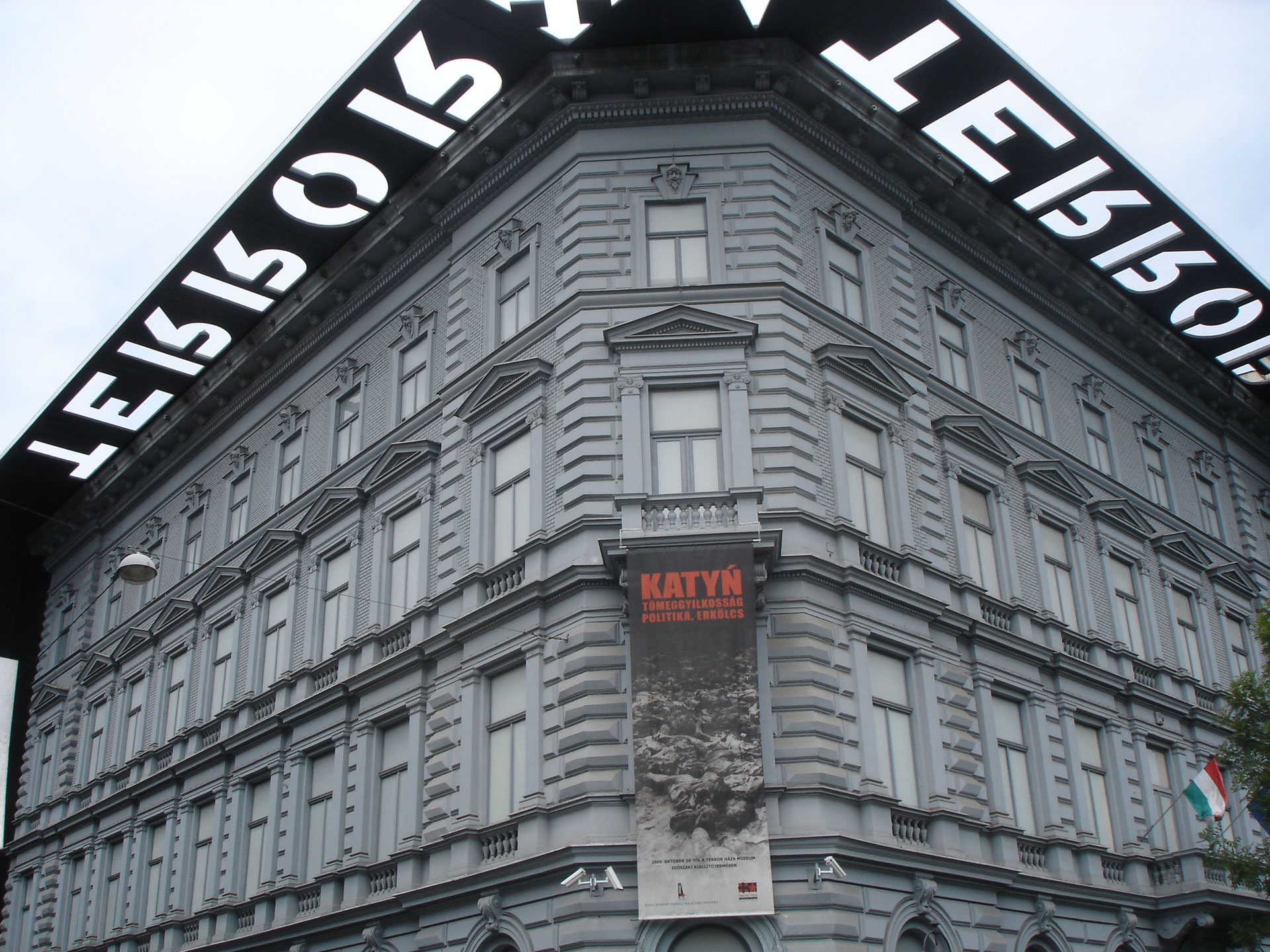
The »House of Terror« opened in 2002 in downtown Budapest by Viktor Orban, the nationalist leader of Fidesz, informs about this. Controversial but enormously popular, the house is said to draw an average of 1,000 visitors per day. The interior design and installations that reenact the country’s dark days are smart and swank. We see in them elements of NSK, Kavakov, Cerný, Oursler – either successful Western artists or East European artists that gained success in the West . For Kende, curator Nikolett Eross and artist Janos Sugar, no matter how rough–cut they may have been, Czechoslovak designers did create something original that celebrated the common memory. Whereas missing the defiant moment of resolution towards its past today’s Hungary is »a captive of its own recent past: the fact that historical experiences have still not been resolved and coped with, together with the modest presence of relevant contemporary content, produces an overflow of competing rhetorical and visual clichés.« This tendency has continued since 1968, the era that is viewed as a period of stagnation, the period when »almost all strata of society were motivated by hazy desires instead of clear–cut goals and ambitions. The strongest of repressed desires was directed at the clichés of consumer society, and the people reflected it in their everyday life with slapdash naivety and misunderstanding.« Hungary has been doing miserably, true to design’s inner logic but untrue to the idealism that political designers are expected to bring about.
a crowd
Back to Kapuscinski. His successors who aspire to write another »Emperor« or »Shah of Shahs« would find the current Thailand a perfect kingdom for a fable, because of the existence of ubiquitous »it«. »It«, as much an abstract concept as a manifested reality, dictates every aspect of the society’s formation; it defines and authorizes a citizen’s perception of him/herself in the society. »It« officially does not exist in critical discourse, and in a Kafkaesque manner, only a massive use of metaphors and nuances saves »it« from complete extinction from any critical discourse. As the eminent physical disappearance of »it« will happen some time in the near future, the uncertainty and unsettled state of mind of people and the authorities towards the change is currently resulting in tighter and tighter control of freedom of expression.
In this kingdom, if a designer decides to be political he will immediately be challenged by public perception of sensitive topics, by state censorship as well as self–censorship. As a designer he would need to address a wide strata of society, this will also be challenged by the population’s unequal level of education and information. Thai graphic designer Pracha Suveeranont has found simple iconography, old cartoons and folk aesthetic that the citizens are familiar with to be a useful tool for his political design. The prime example of this is »Vote No to Draft Constitution« campaign materials that he designed in 2007. Thanks to the design technique of Suveeranont, citizens, including factory workers, street vendors, farmers and fishermen, understood the complexity of the 2006 coup and that resulted in 41.37% voting NO .
Similar to architects, in general Thai graphic designers’ challenge throughout history has been the authorities’ expectation for the designers to find a fine balance between looking modern (to avoid being colonized) and to take a motif from inherent »Thainess« (to stir up nationalism), according to Suveeranont. Recently the balance has had to include a demand from global corporations as well. The Thai designer who works both in commercial and political areas sees a lack of theoretical space for design as a serious problem; the de-theorization is supported and preferred by designers and advertisement producers in Thailand, by simply wrapping the complex process of design works into a generic term – »communication«. This is also a metaphor for the country’s problems – the authority’s preference of using references from the commercial sector when they discuss social changes, rather than encouraging citizens to create genuine terms so that they can stand on their own terms; this has resulted in a dispirited marriage between authoritarian governance and corporate Machiavellism. This model is also believed to be fitting to the Thai social mindset that tends to lay more weight on »face« value than on principles.
Coming out of the 1973 and 1976 student movements – the Thai equivalent of Gwangju – as a student activist that fled the country like other prominent activists and left– intellectuals, a crowd was a point of departure for the designer, which he later elaborated into his design philosophy; in it he separates crowd from governmentally and commercially–produced homogeneous mass, and an enlightened individual from a manufactured consumer:
»When I design, I try not to see people in terms of a consumer. I would imagine a single reader (or a viewer) and then set out to create a work that is meant to be read by an individual. Each individual has many dimensions but a designer should look at him as an intelligent human being not an ignorant one. After all, the average consumer characterized by homogeneous behavior just doesn’t exist.«
In the Thai situation described above this attitude has become activism itself, which has made him a much sought–after soul by political activists. The use of an old comic or a folk aesthetic thus, was his response to the ever-increasing request by activists and conscious citizens to provide guidance for the country’s reform; Suveeranont discovered, in between the moral gap of government and corporation, peoples’ genuine terms, which is now called »vernacular Thai« by the designer . Vernacular Thai is hence a metaphor, a handbook, and kind of activism that has become a symbol of his political design. The use of the concept as a clear method of design demystifies the »Thainess« that had been promoted by the authority for a century, and the »Thainess« that has been used in more recent time by some Thai artists such as Rirkrit Tiravanija or Navin Rawanchaikul.
The wisdom and method that the Thai designer applies inspires us to look at other examples particularly from the Islamic world, in which graphic designers work under even more restrictions and regulations.
Neo Liberalism and after
As Thomas Doherty points out, in the polity in which the subject as >consumer< usurped the subject as >citizen< and democracy is debased to a mere »freedom of choice«, »there is no possibility of substantive change, no possibility of history.« While Aneta Szylak explains about Polish socio–cultural psyche towards revolution as a communal event »that gives the feeling of community: the taking over of power is tantamount to its end,« after she describes the current dispute in Polish culture and whether Solidarity can be treated as the one that overthrew the authorities or the one that became one. In this dichotomy–based, dilemma–led inertia that depicts our present, what could be an alternative?
One of the interesting models can be found in the Indian state of Kerala. The State has been governed by the Communist Party of India (Marxist–led Left Democratic Front) since 2006, as the first communist party ever voted in with majority in any democratic election.
Group Design & People emerged from the strong left tendency of the region, the cyber generation of Creative Commons and P2P, and the Vedic tradition. As fulfilling a basic mission of helping activists and local NGOs (that »deserve good design but cannot afford one«) with design, and stimulating democratic discourses that can be triggered by design issues, the group, using online platform, also acts as a free agent that connects citizens groups and international designers. In all these activities, they promote an idea of »copyleft« in design.
»Unclaimed actions«, the term the group prefers to use in place of »anonymous« in ostracizing ownership, implies their graphic design’s activistic and performative objectives. Unlike Creative Commons that has emerged as the latest entry to the legal evolution in West (in which copyright originated in the 18th century ), the Kerala group’s philosophy behind their de-ownership action comes from Vedic concept of natural decay that is to be treated naturally: all the biological components decay and go, nothing can stop it and nothing is owned by anything in the end. The idea was found in the term »Swaraj«, Mahatma Gandhi’s interpretation of a Vedic term as self–rule and self–restraint. Employing the term, the post-colonial position of the group is to be its own model, not influenced by copyright law that is by no means universal. The 1997 Economic crisis and recent financial crisis have lead people worldwide to rethink the vice of the global financial system, and prompted them to come up with alternative systems, wisdoms and survival methods. In this climate, the group, through graphic design, offers idealism that ensures history making and community building are not all gone.
Looking at the saga of such political design, the Solidarity logo has gained interpretation. History has gained interpretation too by us listening to designs’ told and untold stories.
Design has told, and it will tell more.